Category Archives: Design Stuff

Favorite Blog Posts From March (you might not have seen these)

Hey there, I write on a number of different blogs … you might not have seen these so I wanted to share them with you here:

From my JibberJobber blog: Seth Godin: Pick Yourself

From the Career Resumes blog: Job Search: You Have To Pick Up The Phone

From my LinkedIn blog: Optimizing Slideshare On Your LinkedIn Profile

From this Jason Alba blog: pill vs. vitamin

Enjoy!

Pill vs. Vitamin

A few months ago I was talking with someone about business and marketing and they introduced a concept new to me, but I got the impression that everyone else had already heard of it.

When you are selling/marketing something to someone, do they percieve it as a PILL or a VITAMIN?

The purpose of a PILL is to alleviate a pain (for example, a very bad headache).  The effects should be somewhat immediate. The value of the PILL, at the moment of pain, is really, really high.  I have a PROBLEM and a PILL is an immediate SOLUTION.  You know the perceived value can skyrocket, especially as the problem, or pain, is higher and immediate.

A VITAMIN, on the other hand, is more of a preventative measure.  You don’t take a VITAMIN to get results within 30 minutes…. VITAMINS are a subtle solution to a long-term, non-immediate problem.  The pain is not there, and you might wonder if it will ever come.  It’s easy to feel like it’s a non-essential solution to a problem you might not (or, likely won’t) have.

When I heard this I was perplexed, and I asked, are my offerings (products+services) perceived as PILLs (high value, immediate need) or VITAMINS (nominal value, not sure if really needed)???

Figuring this out, and perhaps even repackaging and repositioning, can help you sell more, make more, and become more valuable.

Or, you can keep trying to sell a solution for a non-problem.

OF COURSE, if you look at Covey’s four quadrants, you know you should spend time in the Important/NotUrgent box… which seems to me to be the VITAMIN mindset… but how many of us (or, our customers) are in the Urgent/____ box?  That’s where the PILL comes in.

How are you positioning YOUR offering?

Seth Ahonen: Amazing Artist

I had a meeting in a coffee shop today and saw someone Seth Ahonen drawing.

DRAWING.

He had a picture of a baby and was recreating it with pencil (I’m sure there’s a cooler, more technical way to say that).  It really was amazing to watch (since I have no artistic ability).

Here’s his website – check out his portfolio.

I didn’t see a picture of any of the portraits that he draws (from a picture), but I found a great portfolio of his breadth – really quite fascinating. I am thinking of a picture I can send to him to have him draw it – really, really awesome.

Two Entrepreneur Words

I recently posted my 5 favorite words, as a business owner, designer, product manager.  Here are two more words I’ve been thinking about lately.  Both have to do with marketing something… when someone wants to buy “something” from you, you have to be able to easily communicate what “it” is that you have to offer.

System: “7 steps to ___,” or “4 ___ in 4 days,” or something like that.  Think: Seven Habits of ______.  People like to know you’ve (supposedly) thought of all the angles and have come up with an amazing SYSTEM that solves their problem.

Package: Very similar concept to a “system,” but a package doesn’t have to have a system to/in it.  The package can be something like “buy 8 hours for the price of 10,” or “get a book, ebook, DVD and upgrade for ___.”  I do this here.

If you are a consultant I recommend you do this immediately – your clients expect it (even if they don’t know they expect it.

Go check out my other 5 favorite words – I didn’t realize this was going to be a series, and will probably be an ongoing series… 🙂

Scary Spam

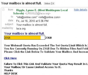
This is really clever, very scary… I think the spammers will have a good success rate with people clicking on this:

here are the things to watch for:

  1. I don’t know the “from” person, and “local schools” doesn’t make sense to me (but it might to a lot of students :s)
  2. I went to laca.org and it wasn’t a real website… didn’t go anywhere.
  3. online.com?  Too generic…
  4. subject line has a period
  5. I don’t have a mailbox with 23GB.  I Don’t have an account with them.
  6. NEVER, EVER “click here” to validate a mailbox… or anything that you haven’t specifically requested.
  7. Other poor grammar towards the end of the email

When you mouse over the “click here” link you see it will go to this URL:

A few red flags here, also:

  1. the URL doesn’t match the sender (laca.org)…
  2. the subdomain starts with scripts. … NOT GOOD.
  3. 4goodhosting.com?  Seriously?
  4. form1.html?  Very novice.

This has yellow and red flags all over it – but they’ve done a very good job. PLEASE don’t click on anything that looks like this.  Simply delete it (or, if you are on Gmail, report phishing, or report as spam).

Gmail Team: Please Fix This

UPDATE BELOW…

Taking a quick break from my book thingy

I have migrated over to Gmail and Google Apps (which allows me to have gmail functionality on my business email) completely … and I have one major beef that would be simple to fix.

In Outlook, when I start a new email, or reply, my EMAIL SIGNATURE is put at the top of the message, no matter how long the message was (in other words, even if I’m replying to a message it is at the top, NOT the bottom).

In Gmail, if I reply to a message my EMAIL SIGNATURE is put at the BOTTOM of the entire thread… which means I have to go to the bottom, cut the sig, go back to the top and paste it.  It’s a pretty lame way of doing it… and I’m guessing just an oversite… but seriously, you’d make my life 10 times easier if you just put the signature at the top of the email on all messages (new and replies)…

What do ya think – can you do that for me?  Pretty please?

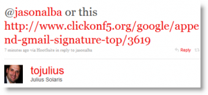
UPDATE: Twitter works!  Gmail didn’t necessarily fix it because of Twitter, but I got my solution from Julius Solaris:

That link is a step-by-step description of how to accomplish what I want using Google Labs – it’s basically another setting I just had to turn on…. THANK YOU Julius – and Gmail – get that out of labs 🙂

Anti Spam, Viral Growth

This is brilliant.

Many sites grow “virally” by tricking you into “inviting” your contacts to join.  The idea is an invitation from you is probably something your contacts can trust… companies count on that trust to get eyeballs and signups from your (inadvertent) actions.

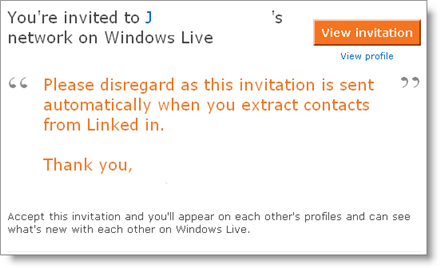
This caught my attention this morning… a user of one of those systems knew what was happening and wrote a brilliant “don’t do it!’ piece – check it out:

anti_spam

Please disregard this invitation because they did it automatically and I don’t know how to undo it… so here’s some word of mouth – DON’T SIGN UP FOR THIS SYSTEM.

I really appreciate that my contact saw this before he blasted it out to his entire network – in my eyes his credibility shot up 10-fold.

Imagine if websites didn’t do this type of thing.

Gmail Brilliance

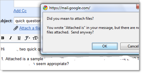
I just wrote an email and hit the send button… check out the popup that I got:

gmail_attached

I admit it is a little eerie that gmail reads my mail, but you must realize this has been happening with all hosted email for over a decade… right?

Anyway, I regularly hit send before putting the attachment in…. it looks like that might not be an issue anymore?!?

Brilliant user design Gmail!

Want to be an entrepreneur?

Have an inclintation to be an entrepreneur?

Read this post by Tim Ferriss, called Why Grow? and other wisdom from 37Signals.  Here are some of my favorite parts:

>> 37Signals is focused on getting sh*t done instead of chasing the Silicon Valley venture capital death spiral. Financing has it’s place, but it’s a means to an end and shouldn’t be confused with an end.

I’ve played around in the funding space for almost four years, thinking about getting funded, talking to people who have gotten funding, asking advice, talking to investors, etc.  I have recently been going to any Funding Universe Crowdpitch I can, which is really enjoyable, but I’m still leery of looking for outside investors, so I really appreciated that line 🙂

>> More than 3,000,000 people worldwide use 37Signals products

WOW.  3M.  That is amazing.

>> Have you ever noticed that while small businesses wish they were bigger, big businesses dream about being more agile and flexible?

Talking about the perfect size of a company… everyone is looking for that greener grass. Huge used to be the goal, but look at all the huge companies and all the problems they have?

>> The easiest, most straightforward way to create a great product or service is to make something you want to use.

I love that entire section… examples of companies that started because founders had their own itch to scratch, came up with a solution, and have done very well.

Very nice, inspiring post. I’ll have to check out the book.

What Makes A Blog Suck

I pick up a little side work as a social marketing consultant here and there.  Today I was working on a project looking for relevant bloggers to network with in a niche space. I went to alltop to find the blogs they have listed for this topic and opened all of them in tabs so I could see if I liked them.

I was specifically looking for people who had street cred as a blogger in that space.  I found a bunch that I liked. I was also reminded of things I hate.  Here’s my hate list:

  1. Very dark background, very light font. Think black background, white font.  IT SUCKS.  I hate this. I have bad eyes, and I’m in front of a computer about 10 hours a day.  When I get to a site that has black background with white font I find my eyes hurting pretty quickly and I just have to go away.  (surprisingly, many people have this sucky color scheme on their Twitter bio area.  Do they not realize it SUCKS?)
  2. Funky font.  Bright colors. Really big text.  Different font types throughout a post.  Look, I get it… you want to somehow accentuate something, right?  Bring out a big idea, or whisper or something… my heavens, don’t do it by making the font 8 times bigger than what it should be.
  3. Too many linked distractions. I like to read blogs without a lot of noise.  Don’t have dozens of links all over the place. Here’s an example – don’t put a link to a community or forum unless you have enough people (that is: more than you) in that community and forum.  Work up to it, but don’t lead me all over your site to places that have tiny bits of information, but none of them have any real substance.
  4. Too little information. I want to know about YOU or the topic.  Don’t doodle in blah blah blah.  I’m amazed at the contrast between a very strong, on-topic blogger compared to a blogger that wanders all over Boringville and never makes a relevant point.
  5. Lots of off-topic posts. I know you like your kitty cat.  I know you like your spuds, flowers, car, favorite pair of jeans, etc.  But if you have a topical blog (that is, not a personal here’s-what-i-ate-for-lunch-this-last-month blog, then severely  restrict your off-topic posts.  If you want to have a following for your topic and you talk too much about junk you’ll lose people.
  6. Cussing. You are a big boy or a big girl, I get that.  But the more strong language you use on your blog the more you are going to turn people off.  Or maybe you don’t care… that’s fine.  Your blog is more about venting your feelings than about developing an audience and a community – that’s fine.  But I can’t follow you much if you are constantly offending me.  Prude, I know.
  7. Link bait, or dropping a lot of keyword searchable words. I don’t want to read your blog because I’m a search engine, I want to read it because I’m a human being.  It’s okay to put the link stuff in there, and put keywords in there, but can you at least work it into proper grammar and have it relevant to what you are writing?
  8. Widgets. Kill most of them.  If you are widget crazy I won’t even wait the three minutes it takes for your blog to come up… I’ll just close the tab and not come back.  Seriously, don’t YOU have something more value-add on your blog than 18 widgets?  You are better than that (I hope).  Don’t distract me with useless crap.
  9. Google Ads, if you are a legitimate business/blogger. I’m amazed at the sites that have Google ads on their site.  I’m quite biased against google ads because the goofballs at Google shut down my ad program (lame story).  But here’s why I don’t recommend it: (a) it is a distraction that you can’t really control, (b) if I click on the ad, I GO AWAY from your site, and (c) I wonder why a business or legit blogger would ever sell valuable real estate on their blog for $18/month (what I’m guessing most bloggers are getting).  Seriously, figure out something more value-ad to give to your audience.  Google ads to me says “I don’t care to build a community, I’m just hoping the brainless drone who happens to come to my site will be dumb enough to realize I don’t have any value for him/her and they’ll click on the Google ad so I can make five cents.”
  10. ______________________________________. What’s the thing you hate to see on a blog?