There are two websites I login to frequently that I wish would be changed. They cause me a split second of angst, and I’ve been meaning to blog about them for a while. To get this off my chest, almost like a public confession, here they are:
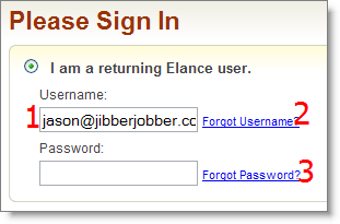
Elance doesn’t quite get the order a user tabs through their login. Follow the numbers to see where your cursor goes when you hit tab:
I should mention, I grabbed this screenshot while multitasking. If I let the page load for a few minutes, then it tabs from #1 to the password field… but hello, I rarely let it sit for minutes, I want to LOGIN NOW!
Guess what happens if you tab from #3? It goes down to other places on the page… I haven’t tabbed enough to see when/if it ever gets to the password page.
I wonder if elance could post a little project on their own site to see if a developer could take, oh, 4 seconds and fix that :p
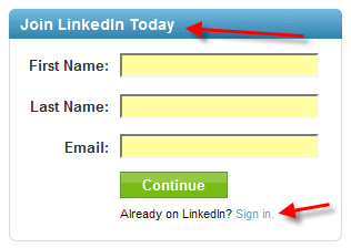
The other one is my beloved LinkedIn. This has been a beef since day one. When you go to the front page of LinkedIn you have this handy dandy form:
They make it easy to sign up if you have never signed up. But what about any of the 24 million people who have already signed up? You are chopped liver, second-class citizen. You must do an extra click, either at the bottom arrow, or at the very top of the page (not shown) where you can click a sign in link.
So, it’s annoying to have to make that extra click… that’s my beef.
But I also worry that this is what I *should* be doing with my JibberJobber login! Check out what we have at the top right of every single page when you are logged out:
We give all visitors the ability to sign in from any page, assuming they already have an account. We are respecting the returing visitors a hair more than the non-users. Non-users get that big read button that says “Get Free Account”… so *they* are the ones who have to click once before they can proceed!
Which is right? I’d like to think that I’m right… but perhaps LinkedIn has high-powered user interface professionals that say what they are doing is totally right… and I should learn from that!
After all, they have over 24M signups… that’s saying something.
Ah, the angst it causes me 😉


