Last night we did a release on JibberJobber with a lot of things. I share some on the JibberJobber blog but usually not all of them (some are UI tweaks that no one really cares about, but they are good changes to make). I’m going to try to document all of last night’s upgrades here.
Google Contacts sync. I’m not talking about this yet because I don’t think it is working 100% the right way… but it’s there in beta mode if anyone wants to try it. I have done it a number of times and it won’t break anything or mess up your data, but I’m not getting the results I think I should get. This has been a HUGE project, but it isn’t over yet.

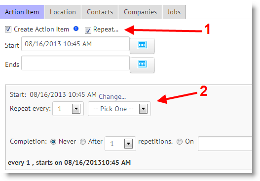
Recurring Action Items. Another HUGE project. Documented, with pictures, here.

Interesting menu change: Network –> Contacts. After years of having the first menu item read “Network” we changed it to “Contacts”. Both make sense to me but the more we thought about it, Contacts makes way more sense. Some people were confused at what they would get under Network… but Contacts is more intuitive. Crazy little change.

Another menu change: adding LOGS to the menu. I’ve said that JibberJobber is a tool to manage contacts, companies and jobs, and the interactions between them. You can now see this reflected on the menu with the fourth menu item: Logs (which shows the interaction between any of those three things).

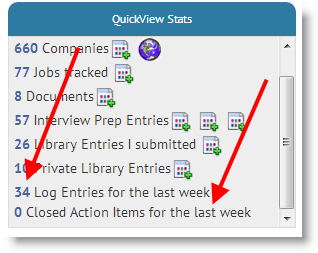
Log Entries and Action Items on the Quickview Stats box: this makes a ton of sense… not only are we looking at the number of contacts, etc. you have in JibberJobber, how about your activities for the last week? We show you how many Log Entries you enter in the last 7 days, as well as how many Action Items you’ve closed in the last 7 days (we’ll make that a ratio in the future, to show you how many were due, and how many you closed).

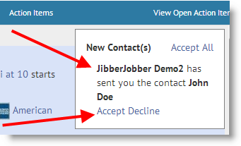
Cleaned up notice box. If another user sends you contact information, or requests to be your coach, or anything like that, you get a notice in a white box in the Action Items panel on the homepage. We cleaned this up… it is easier to read now. And, the action links are more intuitive (I don’t remember what the old words were but they were not as intuitive as they are now). Seems like it isn’t a big deal but it really is. This takes away friction from the user experience… and we need to take away as much friction as possible.

Finally cleaned up the Add Contact issue that no one reported. But it bugged me a lot. A few years ago we introduced the ability to track prefix, suffix and middle name… but there was a glitch where the middle name always showed up, even if you clicked the link to hide it. This made the form see a little more clunky… the box is now gone and the link works fine now. Whew. Isn’t it amazing how little things can bug you so much?

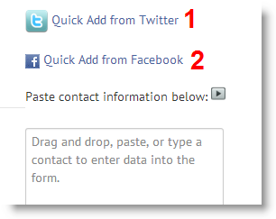
Fixed and enhanced the Quick Add on Contacts. First, we fixed the Twitter quick add (1). Using APIs from other companies is a double edged sword. On the one hand it allows us to do great things. On the other hand, some companies change their APIs in a way that breaks everything. We’ve experienced this with other APIs (like Google)… but we finally fixed the Twitter quick add.
We also, at the last minute, added the Quick Add from Facebook (2). I tried this last night where I went to a Facebook contact, copied the URL, and then pasted into the box (after you click on the Quick Add link). It worked charmingly!! Try it (go to the Add Contact page, this is towards the top-right of the page):

Cobranded users get an alternate username and password. If you get a JibberJobber account through another company (outplacement company, university, etc.), with a single click to create your account, you probably don’t know what your username/password is. That model makes you go into that system and then get to JibberJobber. By popular demand we allow you to create your own JibberJobber username and password. This means that you don’t have to go through that system anymore, and if you ever lose access to that other system you can always come back to JibberJobber through your alternate login. This is critical because the data and work is YOURS, and you should always have access to it. Simply click on Account and you’ll see the option to create another username/password. This is what it looks like after you have created it (note, the password tab is where you will change your new password, if you ever want to change it):

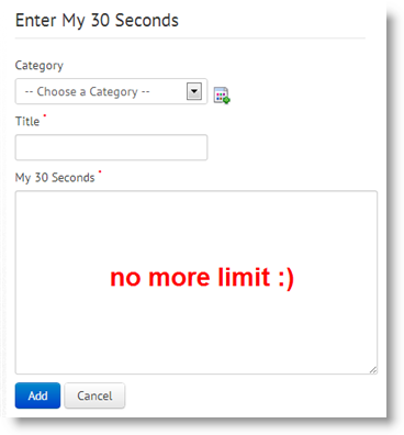
Interview Prep without limits on text. For some reason we capped the answers in Interview Prep to 250 characters. I have no idea why, maybe to keep it under 30 seconds… or something like that. Anyway, this limit is gone. Just try and keep your responses concise 🙂

Ability to add documents from the Detail Page. When you click on Associate Documents from a Detail Page you will see a new button to Add a new Document. Before you had to go to the Doc Manager and add the document, which was a round-about way to do it… now it is a lot easier to easily add a document at the right time.

Cleaned up the Video Library. Our UI designer had us put these big image icon things in two columns. That was great, but it really restricted how long a title of a clip could be, and it quickly became a problem. So we changed it so that only one video would show on each “row,” which gave us as much room as we needed for clip titles.

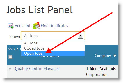
Another popular request is to only show OPEN jobs on the Jobs List Panel. In the past you were able to order by open jobs, or do a search (status:open), but those were kind of temporary and required a lot of hard work (okay, well, maybe about 10 or 15 characters). Now, the default view is to show only the open jobs, but you can change that, as you can see in this new drop down.

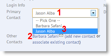
You can change the Primary Contact from the Detail page. Before you had to go to the Company Edit page, then scroll to the bottom and then choose a new primary. Now you simply double click on the gray box over Primary Contact and then choose from any Contacts you’ve associated. You can see by (1) the Primary is Jason, by (2) you can see Barbara is a second (or other) contact, and in the drop down I can easily change from Jason to Barbara. Note, this is how most of the Detail Page can be edited, but this was one of the few things we didn’t do when we introduced the double-click edit feature.

You can now associate an existing Contact when you add a Job. We need to do more work on this (allow you to add a new Contact and associate more than one Contact per Job), but this is an important start.

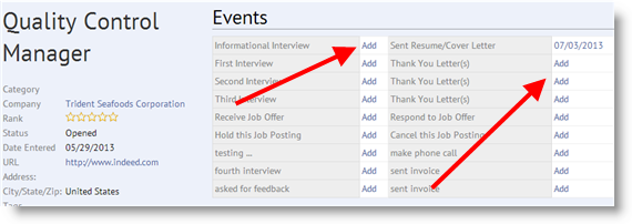
From the Events box it is easier to add a new “event” date. Before, it said “n/a” and it wasn’t clear how to get a date in the box… now you simply click the “Add” link and it will bring up a Log Entry box with the Event already chosen from the drop down box. This is 1000 times more intuitive than before.

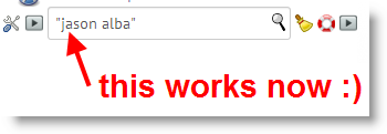
The List Panel search now works with quotes. If you search for Jason Alba you would get results, but if you searched for “Jason Alba” you wouldn’t… now “Jason Alba” is basically the same search as Jason Alba (which is Jason OR Alba). We need to do the same thing on the general search but it didn’t make it into last night’s release.

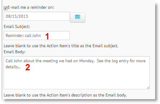
When you get an Action Item via email (which is a premium feature), you can customize the email you get. Before you would get the title of the Log Entry and the whatever you put into the Comments for the Log Entry… now your email is either that OR you can override it and put whatever you want to best remind you of what you need to do.

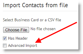
We now have the duplicate checker on non-advanced imports. If you unchecked the Advanced checkbox when importing Contacts (a premium feature), it would do a “quick import” and simply import and then tell you how many records it imported. But, it wouldn’t check for duplicates. Now we are checking for dups so you can have a cleaner database. For the record, I always do the Advanced Import 🙂 I like to see my data and how it is mapped before I pull the trigger.

Speaking of the import, if you choose a non-CSV file we’ll now tell you. Before it just kicked back an error, even though you are supposed to only upload a CSV file, but now it will say something about that (some people try to upload an xls file).
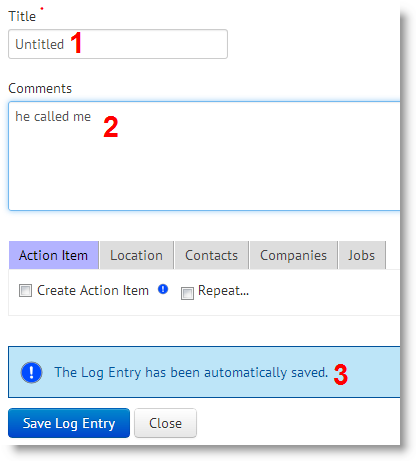
The autosave (3) was a great enhancement we introduced a few months ago. The problem we found is this: if someone called me and I started taking notes in the Comments box (2), I typically didn’t put a title in before I started to write in the comment area. JibberJobber didn’t like that. So, we simply made a title for you, until you make your own: Untitled (1). Simple, I know, but now the autosave will kick in even if you ignore the title field, which is one of two required fields on that form.

There were dozens of minor word changes throughout the system to make things more intuitive, and other minor changes I’m not documenting here. I’m sure we have a long ways to go but this was a great and significant upgrade. Thanks to my team for their hard work and diligence and to the users who gave us suggestions for improvements!

