Category Archives: Design Stuff

2 Common Picture (Avatar) Problems

There are two picture (avatar or image) problems that I constantly see online:

1. Picture is too dark.

This is usually an avatar on a social networking profile like LinkedIn or Twitter.  Mine was too dark, to the point of being accused of being GOTH (lol).  I loved my picture, actually, but I got too many complaints about it and finally changed it to something lighter.

I didn’t think too much about it but lately I have seen a number of pictures on LinkedIn or Twitter – these are SMALL pictures – they are so small that if you have a lot of dark shadows and background it won’t look good.

One reason I see too much shadow is because the image is cropped from a networking event – not an on-purpose picture.

2. Picture is too BIG.

This is a problem I see on many small business owners websites – it is either their professional picture they had taken, or a corporate picture, or something like that.

It’s easy to figure out if it is too big – the way I find out is when I go to an About Us page and the page takes forever to load.  Actually, the page loads while the picture slooooowly creeps up.  Any slowly creeping photo is TOO big.

If you right click the image you can see the properties, which will tell you the size.  Anything under 100K is good.  Anything over that can be optimized (in just a few seconds).  Anything over 500k or 1MB is HORRIFIC.

Change your picture size to something small (this is the file size, not the dimension of the image) and you’ll have that About Us page loading lickity-split!

(I know, kind of a weird post but it’s been on my mind :p)
A new email signature

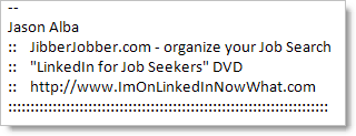
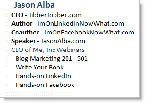
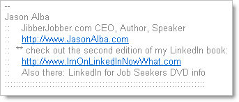
Once again I changed my email signature (here’s another post when I did it before)… here’s the old one:

I did indeed like this one, but I still felt it was too long.  Also, I had the “check out the second edition… ” which I think served it’s purpose, but it’s time to move on.  And I wanted to emphasize JUST two things – JibberJobber and the DVD… so here’s the new one (as of today):

I don’t think I’m getting any goodness out of saying I’m an author or speaker on my signature… you can eventually see that if you click on my LinkedIn blog… but really what I want you to know about is just the two things, so this is an effort to put the more important stuff in front and again clean out the noise.

I am changing this more than I ever thought I would… we’ll see how long this signature lasts 🙂  BTW, the links go to JibberJobber and my LinkedIn blog.

LinkedIn Webinar Sales Page Makeover

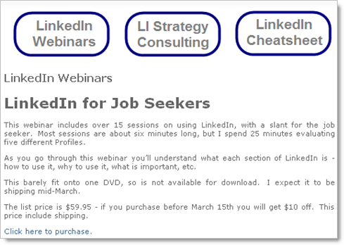
I spent some time with Carl Chapman, website and SEO expert, and he made some suggestions to me about this page, which he said confused him (no in-your-face call to action, etc.):

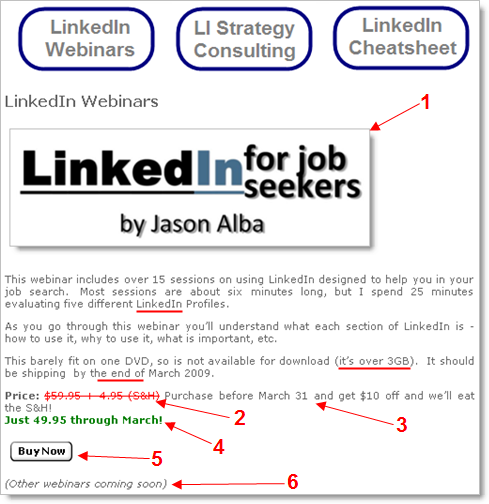
Here’s the new one that I reworked:

Here’s what I did differently … notice the underlines are not included in the changes listed below, but they are different than the old page:

  1. Instead of the text title, this is an image… flashier… jumps out, even has … color (!).
  2. I made the price line more obvious, especially with this red strikethrough, and noting the S&H that the customer isn’t paying for now.
  3. This is broken out from the old statement, which I think is good…
  4. This is bold, green, and on it’s own line.
  5. Buy Now button, instead of a link… this is more clear (there’s your call to action Carl).
  6. Carl mentioned it said “LinkedIn Webinars” but there is currently only one webinar… SO… here’s this italicized statement that the rest are coming.

What do you think?  How else should this be improved?

BTW, if you are interested in the DVD, you can order here. OOPS! I mean, 🙂

Super Freaking Awesome (video update)

I need to update you on the video thing… last post I asked for some input on a video from my new video editor…and since then we have changed some stuff and started to put out new videos (which are now live, and in production).

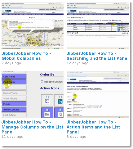
You can see all of the videos we’ve put out for JibberJobber user tutorials here, on Vimeo.  They are hi-def, which means crazy big files, but Vimeo handles it well, and the user doesn’t see slow download time (afaik). Also, if they make the video bigger the quality is good.  Cool.

I’ve also been working on the first series that I’ll sell – because it is HD we can’t do downloads as it’s GBs of info – just barely enough to fit on one DVD.  More on that soon!

Thanks to everyone who gave input on the video post from last time 🙂

Today I (tearfully) retire my email signature

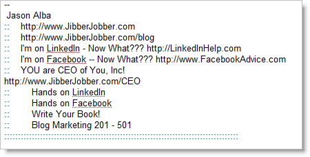
I’m a strong advocate of having an email signature that helps me know who you are.  I want you to know who I am, and what I can offer you.  Thus, I created and have used this email signature for a long, long time:

In Outlook (with html):

In Gmail (no html):

After getting a comment on my LinkedIn blog (it’s pretty funny), and another comment on Young PR Pros (in jest, of course), I decided it was time to try something else.

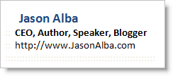
So here’s my new signature:

I could only do this since I redesigned JasonAlba.com (it used to just be a blog, but now has a landing page with all my other stuff).

I worry that people won’t know about all the cool stuff I do, and not know what I’m about.  It’s kind of scary.  However, I wonder how many people previously sifted through my other signature… how many JibberJobber signups I got because of my sig, how many book sales, blog readers, CEO Webinar purchases…

It’s kind of like when you come up with your 30 Second Commercial… you feel like you are leaving so much out, and how in the world could you cut stuff out??  But you have to.  And so did I.

It’s a new day, and perhaps I’ll regret it, but I doubt anyone will suggest I shorten my signature.  Scary but good… that’s my gut feel right now.

Why I stopped doing creative stuff

Yesterday I had a pretty rough day. More on that next week on my JibberJobber blog.

To end the day, though, I thought I’d carve out some time and put together a powerpoint to try slideshare.net. I’ve been wanting to do it for a while, but really wish I had a really creative person to do it for me, or at least check it out. Someone like Armano, or Geno (both of whom I’ve met in person).

It’s not that I don’t like to pretend I’m creative. But something happened two years ago that made me stop and think harder about what I was doing.

I put out a press release.

It was uber-successful.

And that success scared me.

Scared me into thinking I had to be more thoughtful, more careful, with these types of things.

And I stopped. No more press releases. Nothing that an ad agency, or a PR firm, should do.

I scared myself into non-action.

And that was dumb.

Buying ads on Yahoo’s network

yahoo credit cardSo a few weeks ago I sat down at the computer to buy some ads on Yahoo’s network. I went through their process doing it as quickly as I could (which is hard) because I wanted to be done before the kids got up.

Towards the end I put in my credit card number:

1111111111111111

it was rejected (!) … so I did it again, and again. I double/tripled checked the numbers – I was getting so frustrated! I just spent some valuable time putting this together and now it was rejecting my card! I pulled my personal card and the same thing happened. Dang – why were both of my cards being rejected??

For some reason I thought I’d try it with the spaces, like this:

1111 1111 1111 1111

Guess what – it worked! My thoughts? Why doesn’t a pioneer in the Internet world allow both ways? Why is the spacing such a big deal? Have they tested this??

(of course now I have to go and test my credit card pages and see what’s acceptable – and I realize there are bunches of JibberJobber things that can or should be polished – but we’re working from different budgets here (how’s that for an excuse).)

I bet if I had a Yahoo credit card it wouldn’t have happened… right? Riiiiiiiiiiiiiiiiiiight.