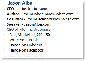
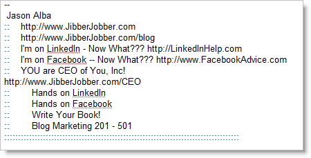
I’m a strong advocate of having an email signature that helps me know who you are. I want you to know who I am, and what I can offer you. Thus, I created and have used this email signature for a long, long time:
In Outlook (with html):
In Gmail (no html):
After getting a comment on my LinkedIn blog (it’s pretty funny), and another comment on Young PR Pros (in jest, of course), I decided it was time to try something else.
So here’s my new signature:
I could only do this since I redesigned JasonAlba.com (it used to just be a blog, but now has a landing page with all my other stuff).
I worry that people won’t know about all the cool stuff I do, and not know what I’m about. It’s kind of scary. However, I wonder how many people previously sifted through my other signature… how many JibberJobber signups I got because of my sig, how many book sales, blog readers, CEO Webinar purchases…
It’s kind of like when you come up with your 30 Second Commercial… you feel like you are leaving so much out, and how in the world could you cut stuff out?? But you have to. And so did I.
It’s a new day, and perhaps I’ll regret it, but I doubt anyone will suggest I shorten my signature. Scary but good… that’s my gut feel right now.


Jason,
At least put JibberJobber back!
Jason, I have waffled with that back and forth for years and added and subtracted to my signature. I think you are right that too much in your signature will annoy some people. Of course, there will always be a part of the population who will be annoyed in general because it is in their nature to be annoyed. With all of the choices in social networks and easier ways to get information, I think that you will be fine.
On the flip side, I think that your positive attitude and the way you reach out to help anyone and everyone will always be remembered, no matter what your signature says.
Jason, I applaud your change. Looks cleaner, and if someone really wants to know more about you, let them click through. Most will. Your signature alone can’t be the only driving factor for your business.
Hi Jason,
I like the new look, but I agree with Anita – I’d mention JibberJobber somewhere — maybe
Jason Alba
JibberJobber CEO, author, speaker
?
Mary McD
http://www.improvemybusinessnow.com
Jason, your sig looks so much better now. There is a ton of great stuff that you’ve done and if anyone reads your stuff or knows about you than sooner or later they will get to know JibberJobber, etc…
I swear by the “KISS” acronym…(Keep It Simple Stupid) 🙂
Hi Jason,
Interesting post i still believe your social accounts should be a part of your online signatures as they represent a part of your online presence and identity. but in order for your signature not to look “any longer..”
we created http://www.wisestamp.com
check it out i believe it will do just what your looking for.
Josh-WiseStamp
Anita and Mary, thank you, I did put JibberJobber back in, as suggested 🙂
—
Jason Alba
:: JibberJobber.com CEO, Author, Speaker, Blogger
:: http://www.JasonAlba.com
::::::::::::::::::::::::::::::::::::::::::::::::::::::::::::::::::::::::
Jason
GREAT decision! I’m joining in the “resimplification” movement! 🙂
By the way: Anita gave you great advice on putting JibberJobber.com back in your signature file. Sometimes, there *IS* such a thing as “too lean”!
Happy to see that you put it back…
Pingback: Jason Alba (al - buh)» Blog Archive » How To Deal With An Internet Stalker
One more suggestion: drop “blogger.” Author captures the concept, whether you write on paper or in bytes. Plus, I think threes work better than fours. Three roles: JibberJobber.com CEO, Author, Speaker.
Pingback: Jason Alba (al - buh)» Blog Archive » A new email signature
Pingback: JibberJobber Blog » Blog Archive » I Love A Good Email Signature
Pingback: Jason Alba (al – buh)» Blog Archive » New Email Signature