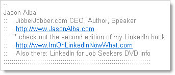
Once again I changed my email signature (here’s another post when I did it before)… here’s the old one:

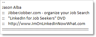
I did indeed like this one, but I still felt it was too long. Also, I had the “check out the second edition… ” which I think served it’s purpose, but it’s time to move on. And I wanted to emphasize JUST two things – JibberJobber and the DVD… so here’s the new one (as of today):

I don’t think I’m getting any goodness out of saying I’m an author or speaker on my signature… you can eventually see that if you click on my LinkedIn blog… but really what I want you to know about is just the two things, so this is an effort to put the more important stuff in front and again clean out the noise.
I am changing this more than I ever thought I would… we’ll see how long this signature lasts 🙂 BTW, the links go to JibberJobber and my LinkedIn blog.
I have had great advertising results with email signatures. You have to keep them short, and rotate them so people pay attention, but I do get traffic.
How about adding a graphic or using some color?