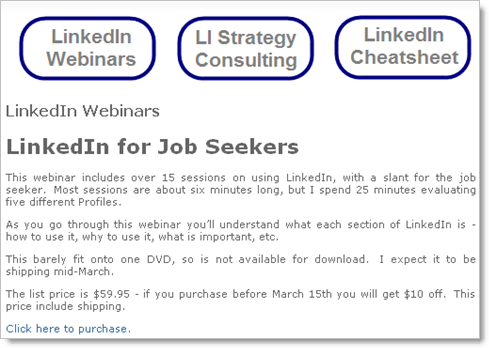
I spent some time with Carl Chapman, website and SEO expert, and he made some suggestions to me about this page, which he said confused him (no in-your-face call to action, etc.):
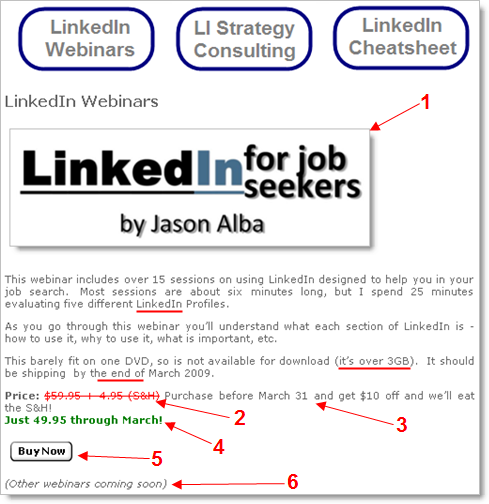
Here’s the new one that I reworked:
Here’s what I did differently … notice the underlines are not included in the changes listed below, but they are different than the old page:
- Instead of the text title, this is an image… flashier… jumps out, even has … color (!).
- I made the price line more obvious, especially with this red strikethrough, and noting the S&H that the customer isn’t paying for now.
- This is broken out from the old statement, which I think is good…
- This is bold, green, and on it’s own line.
- Buy Now button, instead of a link… this is more clear (there’s your call to action Carl).
- Carl mentioned it said “LinkedIn Webinars” but there is currently only one webinar… SO… here’s this italicized statement that the rest are coming.
What do you think? How else should this be improved?
BTW, if you are interested in the DVD, you can order here. OOPS! I mean, ![]() 🙂
🙂

