UI -> User Interface… we still get the occassional email that says “I have NO idea what JibberJobber is/does! What is it?”
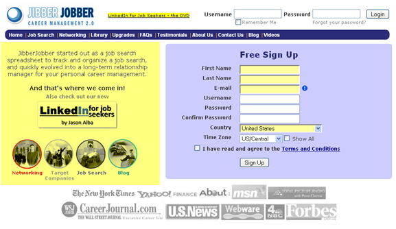
I’ve lived in this world for too long to be unbiased, so we take this feedback seriously and work on little tweaks to help people get it. Here’s the old home page (the stuff in the YELLOW is what we were changing – it wasn’t really YELLOW! Also, I think this is the 3rd or 4th version):
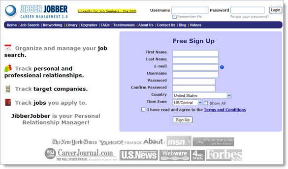
And here’s what we just changed it to (one minute ago):
What do you think?


Like the idea, but the execution…not so much. Not sure if it is simply cleaning up the font so that it looks more professional or perhaps a complete refresh of the home page. The FREE SIGN UP box takes up a lot of real estate that could be used to help promote the value of JJ.
I think that it is now MUCH more clear what JibberJobber is!
I’d love to be able to use my OpenID provider to create the account. I guess I should…
Keep up the good work Jason!